
5: Styles
5.1: CSS
Our user interface up until this point has not looked the best. Let’s change this and add some basic styling which will serve as the foundation for a more professional looking app.
For the sake of this tutorial all styles are put in a single
client/main.cssfile. In a real Svelte application component specific styles are put in a<style>tag inside each component. These styles will be scoped to the component only. Read more about it here.
Replace the content of our client/main.css file with the one below, the idea is to have an app bar at the top, and a scrollable content including:
- form to add new tasks;
- list of tasks.
client/main.css
body {
  font-family: sans-serif;
  background-color: #315481;
  background-image: linear-gradient(to bottom, #315481, #918e82 100%);
  background-attachment: fixed;

  position: absolute;
  top: 0;
  bottom: 0;
  left: 0;
  right: 0;

  padding: 0;
  margin: 0;

  font-size: 14px;
}

button {
  font-weight: bold;
  font-size: 1em;
  border: none;
  color: white;
  box-shadow: 0 3px 3px rgba(34, 25, 25, 0.4);
  padding: 5px;
  cursor: pointer;
}

button:focus {
  outline: 0;
}

.app {
  display: flex;
  flex-direction: column;
  height: 100vh;
}

.app-header {
  flex-grow: 1;
  white-space: nowrap;
  overflow: hidden;
  text-overflow: ellipsis;
}

.main {
  display: flex;
  flex-direction: column;
  flex-grow: 1;
  overflow: auto;
  background: white;
}

.main::-webkit-scrollbar {
  width: 0;
  height: 0;
  background: inherit;
}

header {
  background: #d2edf4;
  background-image: linear-gradient(to bottom, #d0edf5, #e1e5f0 100%);
  padding: 20px 15px 15px 15px;
  position: relative;
  box-shadow: 0 3px 3px rgba(34, 25, 25, 0.4);
}

.app-bar {
  display: flex;
  justify-content: space-between;
}

.app-bar h1 {
  font-size: 1.5em;
  margin: 0;
  display: inline-block;
  margin-right: 1em;
}

.task-form {
  display: flex;
  margin: 16px;
}

.task-form > input {
  flex-grow: 1;
  box-sizing: border-box;
  padding: 10px 6px;
  background: transparent;
  border: 1px solid #aaa;
  width: 100%;
  font-size: 1em;
  margin-right: 16px;
}

.task-form > input:focus {
  outline: 0;
}

.task-form > button {
  min-width: 100px;
  height: 95%;
  background-color: #315481;
}

.tasks {
  list-style-type: none;
  padding-inline-start: 0;
  padding-left: 16px;
  padding-right: 16px;
  margin-block-start: 0;
  margin-block-end: 0;
}

.tasks > li {
  display: flex;
  padding: 16px;
  border-bottom: #eee solid 1px;
}

.tasks > li > span {
  flex-grow: 1;
}

.tasks > li > button {
  justify-self: flex-end;
  background-color: #ff3046;
}
If you want to learn more about this stylesheet check this article about Flexbox, and also this free video tutorial about it from Wes Bos.
Flexbox is an excellent tool to distribute and align elements in your UI.
5.2: Applying styles
Now you need to add some elements around your components. Also, we need to apply our new style to the app using the class attribute. All this work will be done inside the file App.svelte:
imports/ui/App.svelte
..
<div class="app">
    <header>
        <div class="app-bar">
            <div class="app-header">
                <h1>📝️ To Do List</h1>
            </div>
        </div>
    </header>

    <div class="main">
        <TaskForm />

        <ul class="tasks">
            {#each tasks as task (task._id)}
                <Task task={task} />
            {/each}
        </ul>
    </div>
</div>
Your app should look like this:
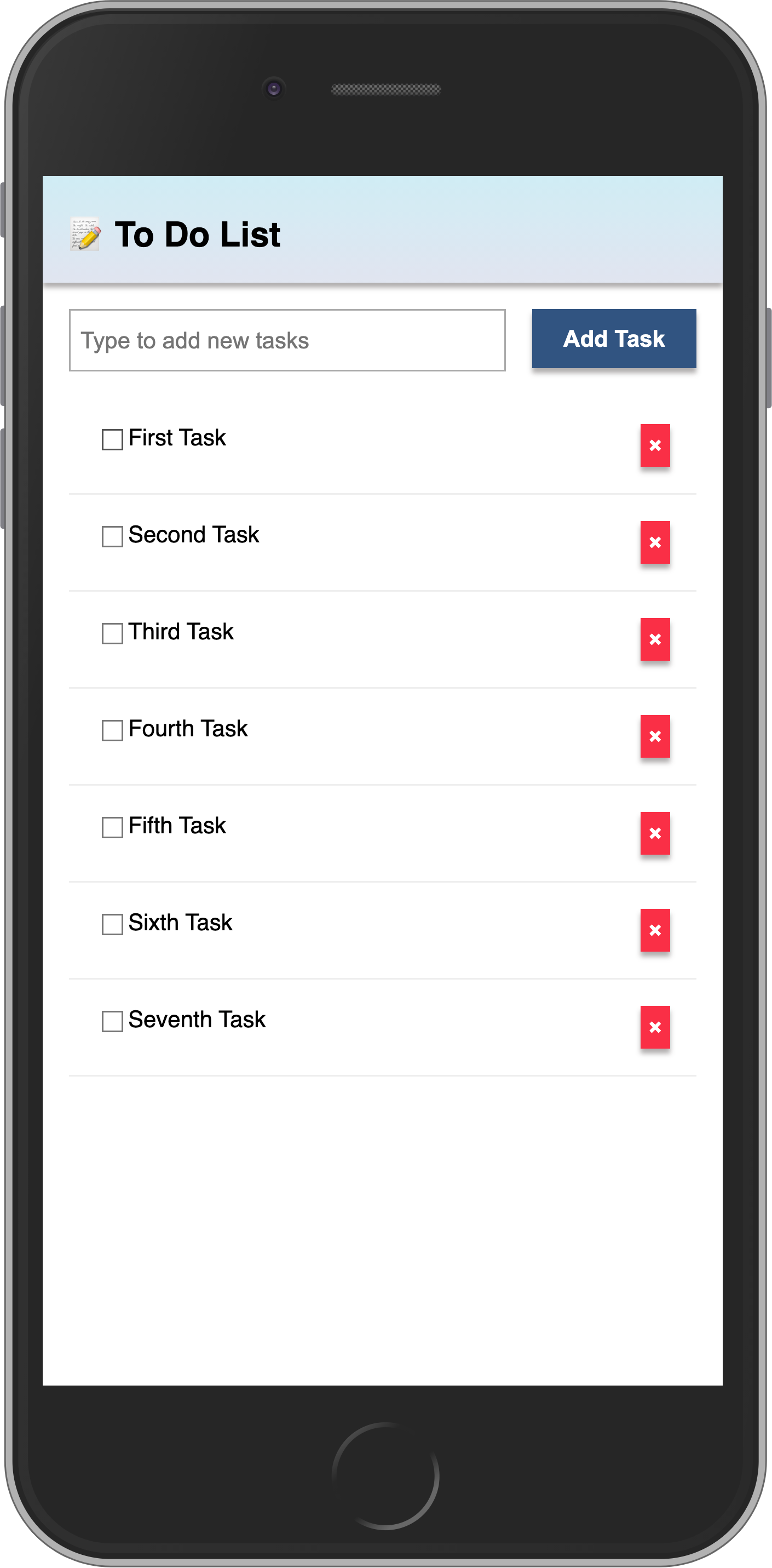
Review: you can check how your code should be at the end of this step here
In the next step we are going to make this task list more interactive, for example, providing a way to filter tasks.